Thông thường, mình hay sử dụng ActivityIndicator để hiển thị cho việc loading. Tuy nhiên, đôi lúc về mặt UI thì nó hơi xấu, và mình muốn xử lý lại hiển thị loading theo đúng phong cách của mình.
Ở bài viết này, mình sẽ hướng dẫn một số loại custom ActivityIndicator sử dụng SwiftUI và sử dụng .animation() kèm với một số thuộc tính như opacity, offset, scaleEffect…
Sliding Circles
struct SlidingCircle: View {

    let timer = Timer.publish(every: 1.6, on: .main, in: .common).autoconnect()
    @State var leftOffset: CGFloat = -50
    @State var rightOffset: CGFloat = 50

    var body: some View {
        ZStack {
            Circle()
                .fill(Color.blue)
                .frame(width: 20, height: 20)
                .offset(x: leftOffset)
                .opacity(0.7)
                .animation(Animation.easeInOut(duration: 1))
            Circle()
                .fill(Color.blue)
                .frame(width: 20, height: 20)
                .offset(x: leftOffset)
                .opacity(0.7)
                .animation(Animation.easeInOut(duration: 1).delay(0.2))
            Circle()
                .fill(Color.blue)
                .frame(width: 20, height: 20)
                .offset(x: leftOffset)
                .opacity(0.7)
                .animation(Animation.easeInOut(duration: 1).delay(0.4))
        }
        .onReceive(timer) { (_) in
            swap(&self.leftOffset, &self.rightOffset)
        }
    }
}
Kết quả:

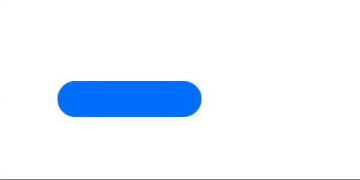
Horizontal Sliding Bar
struct HorizontalSliding: View {

    @State private var shouldAnimate = false
    @State var leftOffset: CGFloat = -50
    @State var rightOffset: CGFloat = 50

    var body: some View {

        RoundedRectangle(cornerRadius: 10)
            .fill(Color.blue)
            .frame(width: 60, height: 20)
            .offset(x: shouldAnimate ? rightOffset : leftOffset)
            .animation(Animation.easeInOut(duration: 1).repeatForever(autoreverses: true))
            .onAppear {
                self.shouldAnimate = true
            }
    }
}
Kết quả:
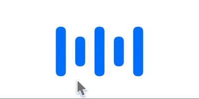
Vertical Bar
struct VerticalBar: View {
    @State private var shouldAnimate = false
    var body: some View {

        HStack(alignment: .center, spacing: shouldAnimate ? 15 : 5) {
            Capsule(style: .continuous)
                .fill(Color.blue)
                .frame(width: 10, height: 50)
            Capsule(style: .continuous)
                .fill(Color.blue)
                .frame(width: 10, height: 30)
            Capsule(style: .continuous)
                .fill(Color.blue)
                .frame(width: 10, height: 50)
            Capsule(style: .continuous)
                .fill(Color.blue)
                .frame(width: 10, height: 30)
            Capsule(style: .continuous)
                .fill(Color.blue)
                .frame(width: 10, height: 50)
        }
        .frame(width: shouldAnimate ? 150 : 100)
        .animation(Animation.easeInOut(duration: 1).repeatForever(autoreverses: true))
        .onAppear {
            self.shouldAnimate = true
        }
    }
}
Kết quả:
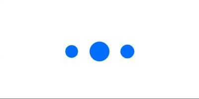
Scaling Circles
struct ScalingCircle: View {
    @State private var shouldAnimate = false
    var body: some View {
        HStack {
            Circle()
                .fill(Color.blue)
                .frame(width: 20, height: 20)
                .scaleEffect(shouldAnimate ? 1.0 : 0.5)
                .animation(Animation.easeInOut(duration: 0.5).repeatForever())
            Circle()
                .fill(Color.blue)
                .frame(width: 20, height: 20)
                .scaleEffect(shouldAnimate ? 1.0 : 0.5)
                .animation(Animation.easeInOut(duration: 0.5).repeatForever().delay(0.3))
            Circle()
                .fill(Color.blue)
                .frame(width: 20, height: 20)
                .scaleEffect(shouldAnimate ? 1.0 : 0.5)
                .animation(Animation.easeInOut(duration: 0.5).repeatForever().delay(0.6))
        }
        .onAppear {
            self.shouldAnimate = true
        }
    }
}
Kết quả:
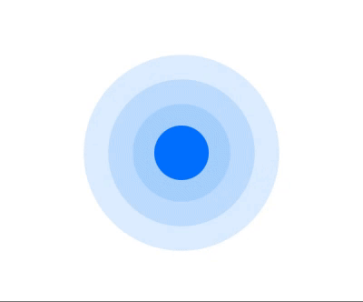
Circle with Waves
struct Waves: View {

    @State private var shouldAnimate = false

    var body: some View {
        Circle()
            .fill(Color.blue)
            .frame(width: 30, height: 30)
            .overlay(
                ZStack {
                    Circle()
                        .stroke(Color.blue, lineWidth: 100)
                        .scaleEffect(shouldAnimate ? 1 : 0)
                    Circle()
                        .stroke(Color.blue, lineWidth: 100)
                        .scaleEffect(shouldAnimate ? 1.5 : 0)
                    Circle()
                        .stroke(Color.blue, lineWidth: 100)
                        .scaleEffect(shouldAnimate ? 2 : 0)
                }
                .opacity(shouldAnimate ? 0.0 : 0.2)
                .animation(Animation.easeInOut(duration: 1).repeatForever(autoreverses: false))
        )
        .onAppear {
            self.shouldAnimate = true
        }
    }
}
Kết quả:
Bạn có thể tạo ra bất kỳ loại loading nào theo ý mình với SwiftUI, nó rất dễ dàng. Bằng cách chỉ cần thay đổi cấu trúc hiển thị và sử dụng .animation() khi cần thiết.
Chúc các bạn thành công. 
Nguồn: viblo.asia